About the Data
The data used for this project come from federal data from the Private School Universe Survey (PSS) and Common Core of Data (CCD) for the 2017–18 school year, which is the most recent year for which PSS data were available. The data analysis is by the Segregation Index, a research team led by Ann Owens, associate professor in the Department of Sociology at the University of Southern California, and Sean F. Reardon, professor of poverty and inequality in education and professor (by courtesy) of sociology at Stanford University. The Segregation Index team imputed missing and implausible race/ethnicity and free/reduced-price lunch data in the CCD; the analyses rely on the imputed data. See the Segregation Index for more information on the data.
line break
The data includes all pre-K–12 students, with a couple of exceptions. The data omits schools that serve pre-K and/or kindergarten only (no higher higher grades) due to the high incidence of missing data on race/ethnicity for these schools. The data also omits Bureau of Indian Education (BIE) schools, which enroll roughly 10 percent of American Indian students, since non-Native students cannot attend these schools and thus it does not make sense to apply segregation measures to them. Virtual schools and those not classified as “regular” in the CCD (for example, special education, vocational schools) are excluded from analyses.
line break
The full dataset may be downloaded here.
Glossary
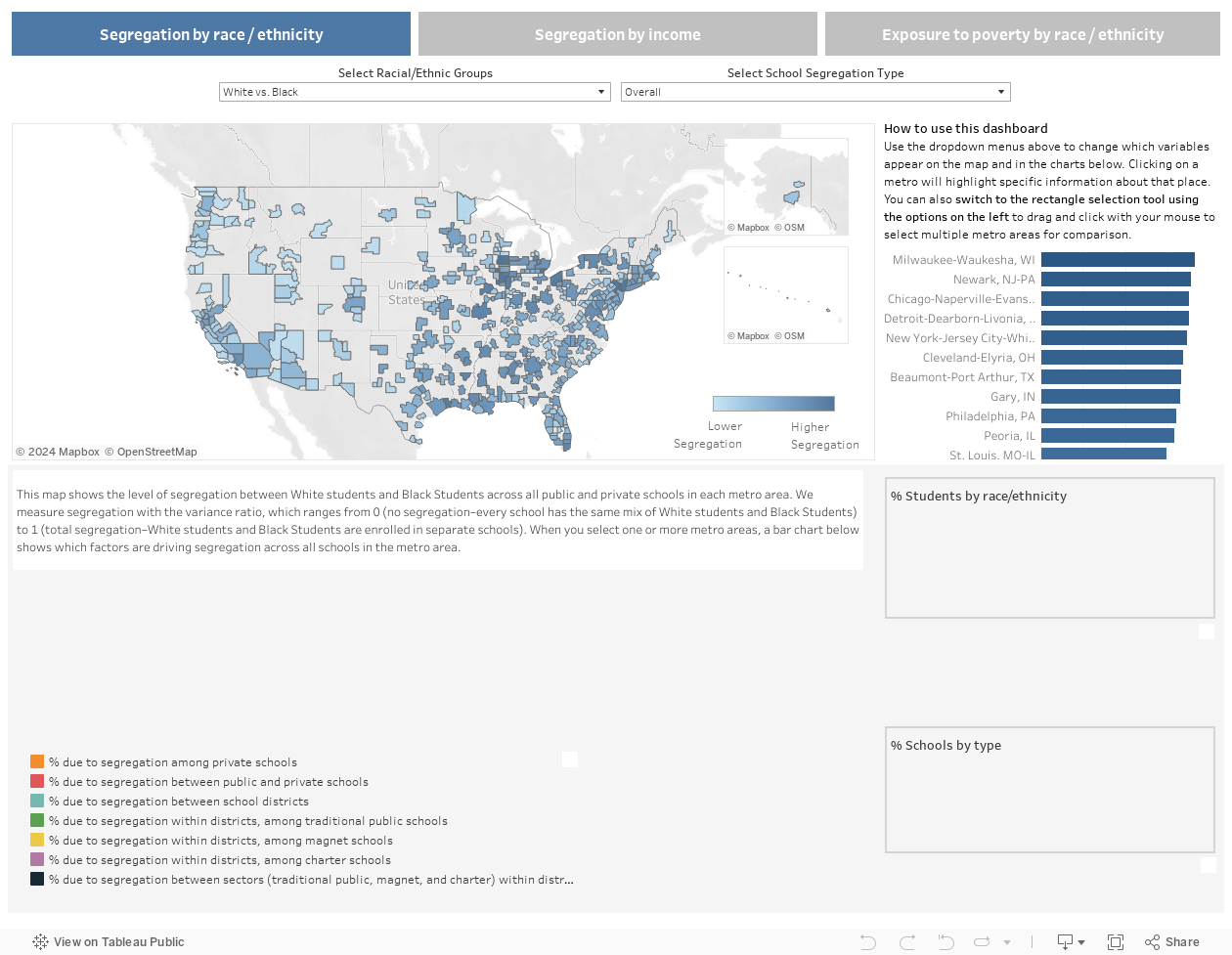
- Variance ratio segregation index: In this dashboard, segregation by race/ethnicity and segregation by income are both measured using the variance ratio segregation index (also known as eta-squared, the normalized exposure index, or the relative diversity index).
line break
The variance ratio is an evenness index that measures the difference between two groups in their exposure to students from one of the groups (ignoring the presence of other groups). The values of the index can range from 0 to 1. If segregation were 0, every school would have the same racial composition—there would be no difference, for example, in the percentage of Black students in the average White student’s school versus in the average Black student’s school. If segregation were 1, it would mean both groups were totally isolated—White students and Black students are enrolled in completely separate schools. The index can also be interpreted in proportional terms: if segregation were 0.7, it would mean that schools are 70 percent as segregated as they could possibly be.
line break
For example, in the Abilene, Texas metro area, total White–Black segregation is 0.147. The segregation measure is based only on the distribution of these two groups, so it ignores the presence of other racial groups. The mix of Black and White students (ignoring students of other races) at the average White student’s school is 88 percent White and 12 percent Black (that is, 0.878 and 0.122, below); the mix of Black and White students at the average Black student’s school is 73 percent White and 27 percent Black. The value of the White–Black variance ratio index is thus the difference (0.878 – 0.731 = 0.147) in White and Black student’s exposure to White students. The measure is symmetrical, so that the Black–White variance ratio index—the difference in exposure to Black students between Black and White students’ schools—is also 0.147 (0.269 – 0.122).
| White | Black | |
| White Exposure to | 0.878 | 0.122 |
| Black Exposure to | 0.731 | 0.269 |
| Difference in Exposure | 0.147 | 0.147 |
- Racial/ethnic groups: The labels for racial/ethnic groups shown in the dashboard have been shortened. The full definitions of these categories as they map onto the categories in the federal datasets are as follows:
- American Indian: students reported in the federal data set as “American Indian or Alaska Native”
- Asian: students reported in the federal data set as “Asian” or “Native Hawaiian or Other Pacific Islander”
- Black: students reported in the federal data set as “Black or African American”
- Hispanic: students reported in the federal data set as “Hispanic or Latino”
- Multiracial: students reported in the federal data set as “Two or More Races.”
- Non-White: students reported in the federal data set as “American Indian or Alaska Native,” “Asian,” “Native Hawaiian or Other Pacific Islander,” “Black or African American,” “Hispanic or Latino,” or “Two or More Races.”
- Income groups:
- Free Lunch Eligible versus Not Eligible: Students who are eligible for free meals through the National School Lunch Program (family income up to 130 percent of federal poverty guidelines) versus all other students.
- Free and Reduced Price Lunch Eligible versus Not Eligible: Students who are eligible for free or reduced price meals (family income up to 185 percent of federal poverty guidelines) versus all other students.
line break
Note that there is no free or reduced price lunch eligibility data available for private schools. As a result, all segregation measures based on these income categories include public schools only.
- School segregation type:The total segregation in a metro area as measured by the variance ratio segregation index can be decomposed into a series of components that together total 100 percent of segregation (when weighted by each component’s size and diversity). This may be visualized as follows:Magnet schools and charter schools are designations in the federal data set. Traditional public schools are all schools in the CCD not classified as either magnet or charter.
line break
Note that there is no income data available for private schools. As a result, the measures of segregation by income include only segregation between public schools and the components beneath that.
- Exposure to Poverty: Exposure to poverty calculates the percentage of low-income schoolmates for a typical student, based on the race/ethnicity of that student and what type of school they attend.
line break
For example, in the Abilene, Texas metro area, the average FRL rate in White public school students’ schools (across all types of public schools) is 52.6. Breaking that down by different types of public schools, he average FRL rate in White traditional public school students’ schools is 52.6, the average FRL rate in White charter school students’ school is 50.9, and there are no White magnet school students (there are no schools identified as magnet schools in the Abilene, Texas metro area).
- Metro Name: This dashboard includes data for all Metropolitan Statistical Areas (MSAs) in the country. MSAs are Metropolitan Core-Based Statistical Areas (CBSAs) and Metropolitan Divisions (identified for the largest CBSAs and used as unique MSA identifiers) defined in 2020 by the Office of Management and Budget. This results in a universe of 403 metro areas included in the dashboard.
line break
The names of metro areas in the dashboard follow the U.S. Census Bureau naming convention: “The title of each MSA consists of the names of up to three of its central cities and the name of each State into which the MSA extends. However, a central city is not included in an MSA title unless it has at least one-third the population of the area’s largest city or local opinion supports its inclusion.
line break
”A list of school districts that are included in each metro area can be found here.
- Closest Comparisons: The metro areas with the closest values on the chosen segregation measure immediately above and below the selected metro area.
- Rank: The selected metro area’s rank on the chosen segregation measure out of all 403 metro areas in the dashboard. A rank of 1 indicates the most segregated metro area in the country for that measure.
About the Project
This interactive data dashboard allows researchers to quantify school segregation and its contributing factors to inform policy discussions and fuel engagement and action. An accompanying report, “School Segregation in U.S. Metro Areas,” summarizes key findings from the data.
This project is a collaboration between The Century Foundation and the Segregation Index, a research team led by Ann Owens, associate professor in the Department of Sociology at the University of Southern California, and Sean F. Reardon, professor of poverty and inequality in education and professor (by courtesy) of sociology at Stanford University. The interactive dashboard was developed by WXY Studio.